Article: Vintage Tie Patterns That Work in Professional Settings
Vintage Tie Patterns That Work in Professional Settings
Last Updated: November 8, 2026
Quick Summary
Vintage tie patterns that work in professional settings are small-scale, low-contrast prints such as foulards, neats and muted macclesfield-style florals. Pattern scale and contrast matter more than the pattern family, so a tie that looks calm from three feet away suits most offices.
- Foulards and small-scale neats are the most formal vintage patterns for client-facing settings.
- Narrow stripes and small geometrics suit business casual and internal meetings.
- Bold geometrics and wide 1970s prints belong in creative or relaxed workplaces.
- Stand three feet from a mirror: if the pattern reads as calm texture, it is professional-ready.
- Pair a patterned tie with a solid shirt, and keep the outfit to two visible patterns at most.
Table of Contents
- A Short History of Men's Tie Patterns by Decade
- Ranking Vintage Patterns by Professional Formality
- How to Match a Tie with a Shirt
- Choosing the Best Tie Colors for the Office
- Checking Condition, Care, and Wearability of a Vintage Tie
- Your Next Step: Building a Professional Vintage Tie Edit
- Frequently Asked Questions
Vintage tie patterns for professional settings give a man a way to look polished without looking like everyone else in the boardroom. The right vintage print can do more for a plain suit than a dozen safe navy ties.
Many office dress codes are looser than they were a decade ago, but a tie still signals care. A vintage tie adds character while keeping the outfit respectable. The trick is knowing which patterns hold up in a meeting and which belong at a weekend lunch.
A Short History of Men's Tie Patterns by Decade
Men's ties have changed shape and print many times since the 1920s. Early pieces were often wide, with bold florals and paisleys. The 1930s and 1940s brought smaller geometric repeats and more restrained color. By the 1950s, narrow designs and subtle textures were common, and the 1960s and 1970s pushed loud, wide prints again.
Knowing this history helps you spot a true vintage piece and judge its era. Narrow, small-scale prints tend to age best in an office. Very wide, loud prints from the 1970s usually suit creative workplaces better.
Ranking Vintage Patterns by Professional Formality
Many guides stop at general labels. A usable ranking shows which vintage patterns suit a conservative office, which fit business casual, and which work only in creative or relaxed settings. The ranking below runs from most formal to most expressive, with the practical reason each pattern lands where it does.
Tier 1, Conservative and client-facing settings
These patterns read as deliberate rather than decorative. They survive a boardroom, a client lunch, and a video call without pulling focus.
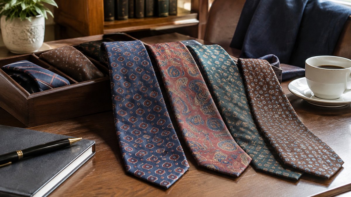
- Foulard. A small, evenly spaced motif on a solid ground. The repeat is tight enough that the tie reads almost as a solid from across a table. Navy, burgundy, and forest green grounds are the safest.
- Small-scale neats. Tiny dots, micro-geometrics, and pin-dot repeats. The smaller the motif and the lower the contrast between motif and ground, the more formal the tie reads.
- Muted macclesfield-style prints. Dense, small repeating florals and paisley-adjacent motifs in low-contrast colorways. These carry more detail than a neat but stay quiet at conversational distance.
Tier 2, Business casual and internal meetings
These add visible pattern without becoming the loudest thing in the room. They work when you are not the one presenting to a client.
- Narrow stripes and diagonals. Keep the stripe under roughly a quarter inch and the color contrast muted. Wide regimental stripes and high-contrast diagonals push toward Tier 3.
- Small repeating geometrics. Checks, houndstooth-adjacent repeats, and tight grid motifs. The rule of thumb: if you can count the motifs easily from arm's length, the scale is small enough for most offices.
- Two-tone woven textures. A subtle herringbone or ribbed weave in a solid color reads as texture rather than pattern and pairs with almost any suit.
Tier 3, Creative, relaxed, and expressive workplaces
These are the patterns vintage sellers love and conservative offices distrust. They are not unprofessional, they are simply louder, and they need a quieter outfit around them.
- Bold geometrics. Large repeating shapes, oversized medallions, and high-contrast color blocking. Pair with a solid dark suit and a plain white or light blue shirt so the tie is the only focal point.
- Large florals and paisleys. Save these for settings where personal style is part of the job, or for evening events rather than morning meetings.
- Wide 1970s prints. The width and the print compound each other. A wide tie with a bold print is the least formal combination in vintage, and it reads as a costume in a conservative office.
The two variables that move a tie between tiers
Pattern type is only half the story. Two other factors shift a tie up or down a tier regardless of motif:
- Scale. A small foulard is Tier 1; the same motif blown up to a large repeat drops to Tier 2 or 3. Motif size, not pattern family, is often the deciding factor.
- Contrast. A navy ground with a tonal motif stays formal; the same pattern in high-contrast black and white reads more casual and more attention-grabbing.
A useful test: stand three feet from a mirror. If the pattern resolves into a clear, calm texture, it is Tier 1 or 2. If your eye jumps to individual shapes, it is Tier 3.
Watch out: a tie that is formal in pattern can still fail in a conservative office if it is unusually wide or narrow for the era of your suit. Keeping the proportions balanced also makes it easier to pair a vintage tie with other subtle patterns, as Baaaad Flockers suggests through the broader principle of mixing patterns cohesively.
The table below sums up which vintage patterns suit each level of formality, based on the ranking above.
| Tier | Patterns | Best for |
|---|---|---|
| Tier 1 | Foulard, small-scale neats, muted macclesfield-style prints | Conservative and client-facing settings |
| Tier 2 | Narrow stripes and diagonals, small repeating geometrics, two-tone woven textures | Business casual and internal meetings |
| Tier 3 | Bold geometrics, large florals and paisleys, wide 1970s prints | Creative, relaxed, and expressive workplaces |
How to Match a Tie with a Shirt
Keeping the scales different and avoiding two busy patterns is a useful starting point. What follows are concrete combinations for vintage patterns, organized by shirt type, plus suit and pocket-square suggestions.
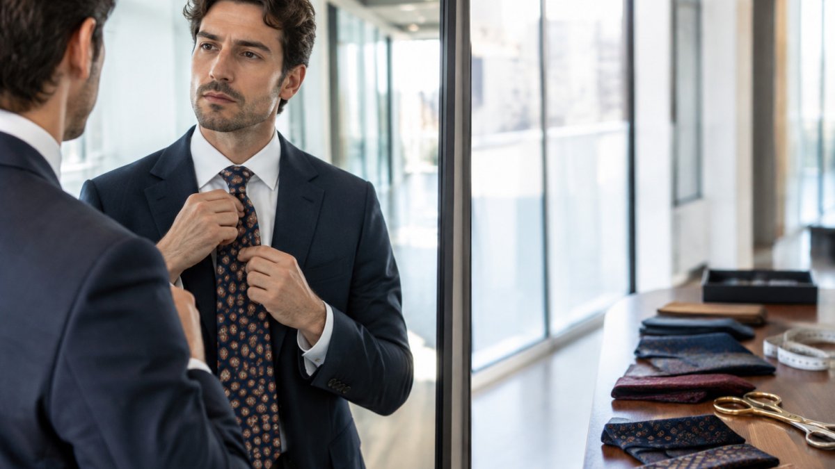
Patterned vintage tie with a solid shirt
This is the easiest and most reliable pairing. The shirt is the quiet ground and the tie carries the pattern.
- Foulard or neat + white shirt + navy or charcoal suit. The default professional combination. A white shirt maximizes the tie's formality, so even a Tier 2 pattern reads sharper here.
- Narrow stripe + light blue shirt + gray suit. The blue shirt softens the stripe and keeps the look business-appropriate rather than corporate-uniform.
- Bold geometric + white shirt + dark solid suit. Let the tie be the only pattern. Skip the pocket square or use a solid white linen one folded flat.
Patterned vintage tie with a patterned shirt
This is where most men get into trouble. The rule is not "never", it is "different scale, shared color, one dominant pattern."
- Small neat tie + faint Bengal-stripe shirt. The shirt stripe should be visibly wider than the tie motif so the scales do not compete. Keep both in the same color family.
- Foulard tie + micro-check shirt. Works when the check is small enough to read as texture from a few feet away and the tie ground picks up one color from the check.
- Avoid: bold geometric tie + bold check shirt, or stripe tie + stripe shirt in the same scale. The eye has nowhere to rest and the outfit reads as noise in a meeting.
Suit color pairings that hold up
- Navy and charcoal suits accept every tier. They are the safe base for a bolder vintage tie.
- Gray suits flatter cool-toned ties, navy, gray blue, burgundy, and mute warm-toned ties slightly, which can help a rust or olive piece read more professional.
- Brown and olive suits pair naturally with warm vintage tones: rust, mustard, forest green, and cream-ground foulards.
- Black suits are the least forgiving. Keep the tie tonal or low-contrast; a bright vintage print against black reads as evening wear.
Pocket squares and the two-pattern limit
A pocket square is a third element, and it is where outfits usually tip from polished to busy.
- If the tie is Tier 1 or 2, a solid linen square in white or a color pulled from the tie is safe.
- If the tie is Tier 3, use a solid square or none at all.
- Never match the pocket square pattern to the tie pattern exactly; echo one color instead.
- Keep the whole outfit to two visible patterns at most, usually the tie and, if you choose, the shirt.
A quick worked example
A vintage burgundy foulard with a small cream motif, a light blue solid shirt, a charcoal suit, and a white linen pocket square. The tie is Tier 1, the shirt is solid, the suit is neutral, and the square is quiet. That outfit works in a conservative office, on a video call, and at a client lunch without adjustment, which is the standard a professional vintage tie should meet.
Choosing the Best Tie Colors for the Office
Navy, burgundy, forest green, and muted gold are commonly chosen office colors. They work with gray, navy, and charcoal suits. Bright colors can still work, but use them sparingly and balance them with neutral clothing.
Warm tones like rust and olive suit a wider range of skin tones. Cool tones like navy and gray blue suit a crisp, modern look. Test the tie next to your face in good light before you commit.
Checking Condition, Care, and Wearability of a Vintage Tie
Vintage silk needs more care than modern polyester. For a step-by-step method to clean and restore vintage silk safely, see Cleaning and Restoring Vintage Silk.
Store silk ties rolled or flat, away from direct sunlight and humidity. Spot-clean small marks with a damp cloth, and have older pieces assessed by a specialist before any deep cleaning. Hang the tie after wear so the fabric can relax.
Watch out: never machine-wash a vintage silk tie, because heat and agitation can warp the lining and fade the print.
Your Next Step: Building a Professional Vintage Tie Edit
Start with three ties: one foulard, one stripe, and one bolder piece for relaxed days. For a broader look at professional men's style, see the full guide. Test each against your go-to suit and shirt before you buy more. This small edit covers most office situations and keeps your wardrobe focused.
Browse the Vinthentic collection to find vintage ties that suit your office and your style, and check the website for current prices before you decide. To learn where to buy authentic vintage clothing, compare sources before you commit.
Frequently Asked Questions
What tie patterns are appropriate for a professional setting?
Small-scale foulard prints, neat geometric repeats, and fine stripes are the safest choices for most offices. These patterns read as polished from a short distance and rarely clash with a suit. Larger motifs, bright florals, and loud novelty prints usually suit creative or casual workplaces better. When in doubt, choose a tie whose pattern is visible only up close, and keep the palette to two or three colors that already appear in your shirt or suit.
Are vintage ties appropriate for the office?
Yes, provided the tie fits the dress code and is in good condition. Vintage ties from the 1930s through the 1960s often feature smaller scales and restrained colorways that work well in business settings. Check the fabric for fraying, stains, or a collapsed interlining before wearing one to work, since a damaged tie undermines an otherwise sharp outfit. Pairing a vintage tie with modern solid shirts and a current suit keeps the look balanced.
Can you wear a patterned tie to a job interview?
A subtle patterned tie is generally acceptable for an interview, especially in fields with relaxed dress norms. For conservative industries such as finance or law, a solid or very quietly patterned tie is the safer choice. Avoid bold geometrics or novelty prints for first interviews. If you are unsure of the company culture, a small foulard or fine stripe in a navy or burgundy palette signals professionalism without drawing attention.
What shirt patterns work with a vintage tie?
Solid white or light blue shirts are the most reliable companion for a patterned vintage tie. If you want to wear a patterned shirt, keep it much smaller in scale than the tie, such as a fine pinstripe or a micro-check, so the two patterns do not compete. Avoid pairing two large or two bold prints. The rule of thumb is to vary the scale: one pattern should be dominant and the other should recede.

Read more
Restore Vintage Buttons and Hardware: A Step-by-Step Guide
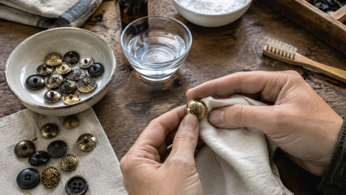
Restore vintage buttons at home using gentle methods suited to metal, plastic and mother-of-pearl. Start your restoration today.
Read more